
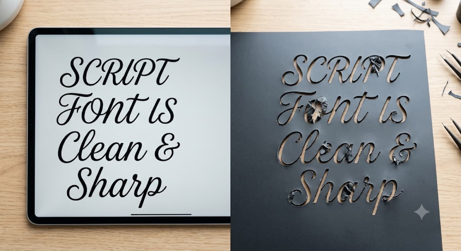
Why Your Fonts Break When You Cut Them (and How Convert to Path Fixes It)
Fonts distort when converted to path because the conversion locks in every curve, counter, and thin stroke exactly as drawn. A font that looks perfect on your screen can cut with missing centers or disconnected parts once it becomes a fixed path. The fix isn't picking a different font. It's checking the path before you cut.
You've been there. The text looked flawless in Design Space. You hit cut. And the "O" came out with no center, or the "R" fell apart into two separate pieces.
This isn't random. It's what happens when a font gets converted to path, and it's fixable once you know what to look for.
What Actually Happens When You Convert Text to Path
Every letter with an enclosed space (think O, A, R, B, D) is built from two shapes bundled together: an outer outline and an inner one. Software treats that bundle as a single "compound path" so the letter renders with its hole intact.
When you convert text to path, that bundle gets locked into fixed geometry. It's no longer an editable font. It's just shapes. The same thing happens with any text to SVG path conversion, not only on a cutting machine.
Most of the time this works fine. But if the compound path grouping breaks during conversion, scaling, or export, the inner shape can detach from the outer one. The letter cuts as an open shape instead of a closed one, and the center either falls away or never gets removed.
That's the root of broken letters in a Cricut font. The design isn't wrong. The link between a letter's outer and inner path got lost somewhere along the way.
Why Some Fonts Break More Than Others
Not every font has this problem equally. Three traits predict trouble more than anything else:
- Thin strokes. Delicate lines leave less material holding the shape together, so a small path error becomes a visible gap or a missing connection.
- Tight kerning or connected script. In cursive fonts where letters touch or overlap, the connection points have to survive conversion. If the path breaks there, the word falls apart instead of cutting as one flowing piece.
- Decorative counters. Swashes, serifs, and unusual counter shapes (think display fonts, not plain sans-serif) create more complex compound paths, which means more places for the grouping to fail.
A clean, bold sans-serif almost never gives you trouble. A thin script font with connecting tails is a different story.
Not sure whether a font is a risk? Look at the thinnest stroke and the tightest connection in your text. If either one looks fragile on screen, expect it to be the first thing that fails on the mat.
Why Your Cricut Font Isn't Cutting Right When It Looked Fine on Screen
Design Space and Silhouette Studio show you the font as live text, where the compound path grouping is still intact. The moment it becomes a fixed path, any break in that grouping shows up, because the shape is now treated as a solid cut path instead of editable type.
Here's the part that catches people out. You don't have to convert text yourself for this to happen. Cutting software turns text into cut paths when you send it to the machine, whether you triggered it or not. That's exactly why checking the result matters.
So if your Cricut font is not cutting right, the font file usually isn't the culprit. The path it turned into is.
How to Fix a Font That's Breaking When Cut
The good news is this is a checklist problem, not a redesign problem. Work through it in order:
Two of these steps are worth a deeper look. Step one matters because the path math doesn't always hold up under resizing, so it helps to know how to scale a design without breaking stroke widths. Step three is easier when you know when Attach and Weld each apply, since they solve different problems.
Need exact dimensions before you convert? This free calculator helps you lock in the final size first:
None of this means redoing your design. Most breaks are isolated to one or two letters, so welding the affected letter or closing one specific gap fixes it without touching the rest of the word.
Resizing text after it becomes a path is one of the fastest ways to pinch thin strokes and close up small counters. Set the size first, then convert.
Catching the Break Before You Waste Material
A broken counter and a self-intersecting path are close cousins. Both come from the same root cause: the path geometry doesn't match what the letter should look like as a solid shape. This piece on fixing self-intersecting paths that cause gaps covers the gap-causing version of the same problem.
If you'd rather not zoom into every letter by hand, CutMagic's SVG Fixer cleans up an uploaded SVG so it's compatible with Cricut Design Space or Silhouette Studio, which helps most on fonts with lots of small counters or connecting strokes.
It won't solve every quirk, especially on heavily decorative or hand-drawn fonts where the "correct" shape is genuinely ambiguous. A visual check still matters. But for the common failure, a counter that silently detached during conversion, finding it on screen beats finding it after the cut.
The Practical Habit
Fonts don't break randomly when you cut them. They break because compound paths lost their grouping somewhere between the font file and the final cut path.
Check counters before you cut, not after. If your Cricut font is not cutting right, run the path checks above first, and you'll catch the problem while it still costs you nothing but a few seconds.