
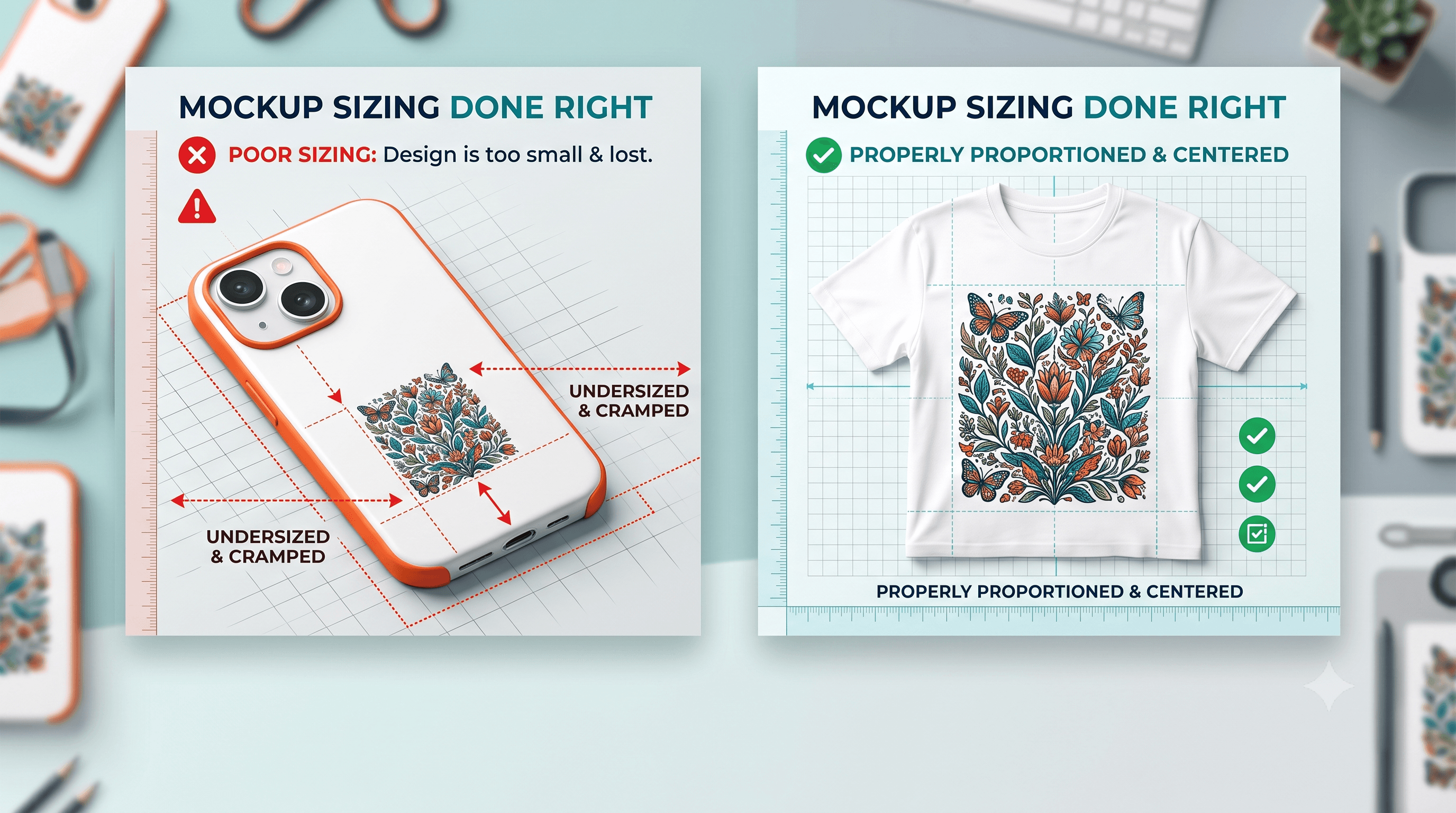
Phone Case vs. T-Shirt Mockup Sizing Mistakes
The single most common Etsy mockup mistake is using the same design scale across product types. A design sized right for a t-shirt looks tiny, cropped, or off-center on a phone case, and buyers notice before they ever read your description.
Why Sizing Mistakes Are So Easy to Miss
Most sellers design once at one scale, then drop that same file into every mockup template without adjusting for the product's actual print area. It's a fast way to work, but it ignores that every product has a different usable space.
This is exactly why these mistakes are so easy to overlook. Buyers don't leave a comment explaining that your design looked cramped on a phone case. They just scroll past to the next listing. Your conversion rate quietly drops and nothing in your shop stats tells you why.
Getting a handle on Etsy mockup mistakes to avoid starts with recognizing that "it looked fine when I made it" isn't the same as "it looks right on every product."
Phone Case Mockup Size Chart
Phone cases have a small, unforgiving print area. Edge-to-edge cases print all the way to the border, while bordered cases leave a visible margin that eats into your design space. Add in the fact that phone models vary in height, width, and camera cutout placement, and a design that looked balanced on one model can shift off-center on another.
A quick reference for common phone case types:
- Edge-to-edge cases: Full-bleed printing, design needs to extend past the visible edge to avoid white gaps
- Bordered cases: Visible margin around the design, work best with centered, contained artwork
- Camera cutout models: Bottom third of the design often needs extra clearance
- Tall vs. compact phone models: Vertical designs may need to be rescaled, not just repositioned
A design built for a t-shirt's wide canvas will almost always look undersized when placed inside these tighter dimensions without adjustment.
Before finalizing a phone case mockup, check the bottom third of the design against the camera cutout for that specific model. What clears one phone model can crop right into the lens on another.
T-Shirt Mockup Size Guide
Apparel gives you far more working room, but that room comes with its own placement rules. Standard zones include full front (centered, large scale), left chest (small, subtle), and pocket-size (compact, understated).
The mistake here usually runs the opposite direction. A design scaled for a phone case, then dropped onto a t-shirt at the same proportions, ends up looking small and lost in the middle of a large blank shirt. Placement matters just as much as scale. A full-front design centered too high or too low reads as unprofessional even if the artwork itself is solid.
The working rule: t-shirt mockups need generous scale and precise vertical placement. Phone case mockups need tight, careful scale and awareness of cutouts and borders. Treating them the same is where things go wrong.
How to Get SVG Design Placement Right for Each Mockup
A simple workflow fixes most of this before it ever reaches your listing:
- Check the actual print or cut area for the specific product before placing the design. Every product has a different usable zone, not a generic one.
- Scale the SVG proportionally rather than eyeballing size across products. What looks right at a glance often isn't right at actual print dimensions.
- Preview placement before finalizing, not after the listing is already live and getting views.
- Compare the mockup preview against the product's real dimensions, not just how it looks on your screen at whatever zoom level you happen to be working at.
This is where previewing across multiple product types earns its place in the process. CutMagic's Mockup Studio lets you preview the same SVG design on a phone case and a t-shirt side by side, so you catch scale and placement mismatches before they cost you a sale, rather than after a buyer has already moved on.
Etsy Listing Photo Requirements You're Probably Overlooking
Sizing problems don't just hurt individual photos. They hurt the consistency of your whole listing. Etsy gives you multiple image slots, and buyers expect to see the design from different angles and, often, on different products if you're selling the same SVG across several item types.
If one photo shows the design scaled well and the next shows it cramped or off-center, the inconsistency reads as sloppy even though each photo might be technically fine on its own. Buyers pick up on that mismatch quickly, even if they couldn't articulate exactly what feels off.
Getting your broader listing setup right, including image count and photo sequencing, matters just as much as getting one mockup correct. The how to start an Etsy SVG shop guide covers listing setup in more depth if you're still working out your photo strategy.
Why This Actually Costs You Conversions
A design that looks off-scale reads as unprofessional or low quality, even when the actual SVG file is well made. Buyers rarely explain why they didn't buy. They just click away to a listing where everything looks intentional.
This is what makes mockup quality worth treating as seriously as pricing or photography. It's part of the same trust signal buyers scan for in the first few seconds on your listing. If you're also refining your pricing approach, the pricing handmade decals strategies guide ties directly into this, since mockup quality and pricing perception work together to shape how a listing performs.
Buyers evaluating SVG files before purchase are also looking closely at what they're getting, and the how to buy high quality SVG files on Etsy guide breaks down exactly what they check before clicking buy.
The Takeaway on How to Make Mockups for Etsy
Check placement and scale for every product type separately. Never assume one mockup setting works across all of them. A phone case and a t-shirt have almost nothing in common in terms of usable space, and treating them the same is the quiet mistake that's easy to miss and easy to fix once you know to look for it.